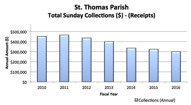
As churches balance the broad range of financial information that parishioners seek, they also struggle with what to report and how to communicate this information. As we continue our discussion on best practices for communicating church finances with impact and ease and choosing the best visuals, let’s turn the infamous bar chart!
The Bar Chart
One of the most common visuals in reports is a bar/column chart. Using bars or other shapes, the visual displays discrete data in separate columns. These charts can be used to show one data set, or compare two or more data sets by lining them up in the same graphic.
Bar Charts Advantages
- The chart offers readers a simple way to visualize data highs and lows at a glance.
- The bar chart can help readers visualize trends, bumpiness or patterns in data. Trends occur when information moves in a general direction, or data can look bumpy meaning that the information is erratically up and down. The graph can also show patterns where data moves in a repeating fashion.
- The use of colors and shapes offer an easy to read and appealing visually.
- Comparing bars one against the other can quickly show progress or differentiation.
Cautions
- If using a variety of colors to display more than two categories of data, ensure that the data can be easily recognized. For example, a black and white report may not show the subtle differences between columns.
- Label the horizontal (X) and vertical (Y) axes.
- Be careful not to overwhelm readers with so much data that the chart looks messy and then becomes difficult to read.
Next up in the world of visuals, Line Graphs! Interested in reading more? Read last week’s post All Pictures are Not Worth 1,000 Words – The Pie Chart
Excerpt from my original article in the Villanova University Center for Church Management and Business Ethics Newsletter, “Communicate Church Financial Information with Impact and Ease” (Spring 2017).
