There is no doubt that church managers are busy people. As you develop a budget, focusing on the “right” areas of the budget means prioritizing your time so that you spend the greatest amount of effort on those areas that will provide the most significant benefits. A nice tool to deploy during this phase of the process is to calculate the Budget Category Impact Percentage (BCIP).
If time is money, the BCIP calculation is a simple formula that can assist you to quickly assess the relative size of a specific budget category as compared to the total receipt or spending for the overall Income or Expense category. If you calculate which categories have the greatest impact on the budget, you can spend the majority of your time focusing on those areas.
Let me use a simple example of revenue categories to show you what I mean:
St. Jane’s Church
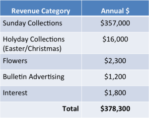
At the fictional parish of St. Jane’s, the church receives revenues from the following sources:

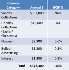
Next, calculate the BCIP by dividing each Revenue Category by Total Revenue.
- Total Collections ($357,000) divided by Total Revenue ($378,300) = BCIP (94%)
- Total Holyday Collections ($16,000) divided by Total Revenue ($378,300) = BCIP (4%)
Using a spreadsheet or other mode to make calculations, you can make the calculations for each category quickly by dragging the formula down the column. As you review the information, what are your observations?

Like most churches, Sunday Collections drive the majority of the income for St. Jane’s. You can see that items like Flower Donations and Bulletin Advertising make up only a tiny proportion of the overall revenue.
“So, why does this matter?”
The problem is that many churches spend an inordinate amount of time on reviewing/estimating/analyzing categories that are not driving large portions of the budget. If you have two hours to spend on a budget analysis, focus on the largest drivers of revenues and expenses. By the way, the same process used above for revenues should also be used for expenses. Most likely, after you calculate the BCIP on expenses, you’ll find that salary and benefits make up a large proportion of expenses, and this makes sense because people are your most important resource! Take the analysis to the next step – what is the next expense category that is driving expenses? And the next?
Tip 7: Prioritize Time – Calculate a Budget Category Impact Percentage (BCIP)
Armed with this information, you can begin by reviewing those categories with the largest impact on the budget. I am not arguing that all budget categories are not important. But, with limited time, focus on the income or expense categories with the greatest impact on the budget.
Read More Church Finance 30/30 Tips
Portions of this text come from Michael J. Castrilli and Charles E. Zech, Parish Finance: Best Practices in Church Management (New York: Paulist Press, 2016) Chapter 5.


